
How to create a metric selector to control which measure is displayed in your set of Data Studio charts
Let’s go back to the basic to create a simple metric selector. This allows to change the measure displayed inside
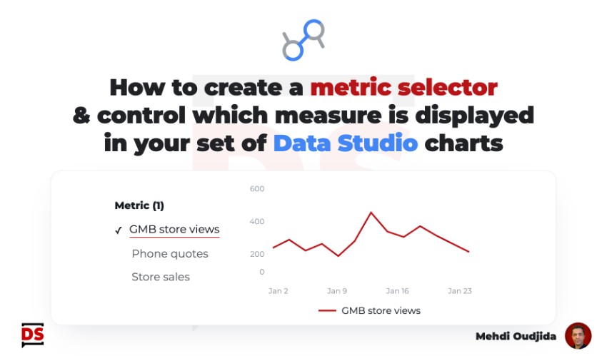
Let’s go back to the basic to create a simple metric selector. This allows to change the measure displayed inside
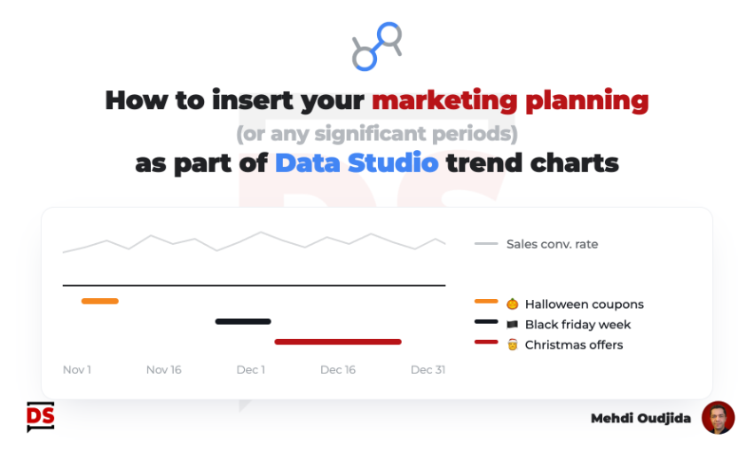
Few years ago, I wrote a tutorial about how we can include annotations inside Data Studio line charts. My custom
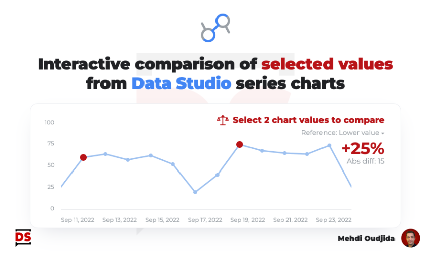
Keeping charts as simple as possible is very challenging. For some cases, a single interactive feature can offer a first
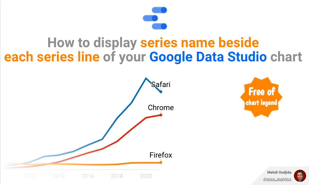
For a lot of cases, legends are not the best visualization solution for line chart (and similar trends chart types).
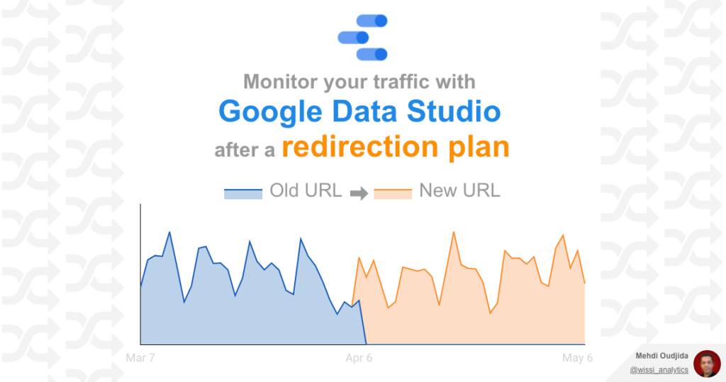
The preparation & the deployment of a URLs redirection plan require method, know-how, a lot of rigor of execution, involving
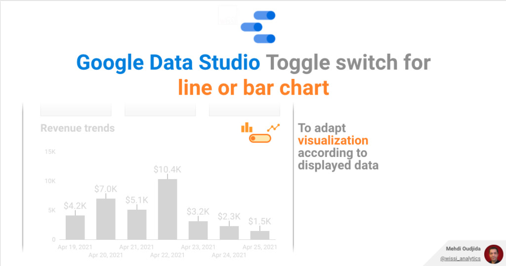
Let’s continue the exploration of Google Data Studio parameter feature with this new example. This time, we will combine parameter
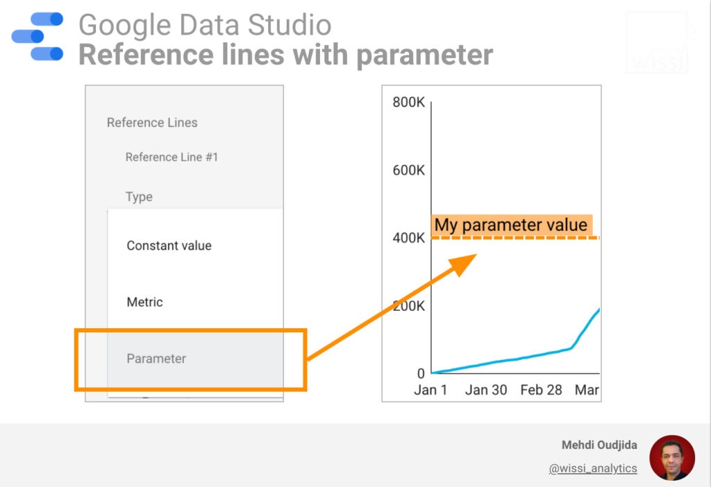
Today, Google Data Studio team has released a new feature offering more interactivity for reference lines, available on scatter &
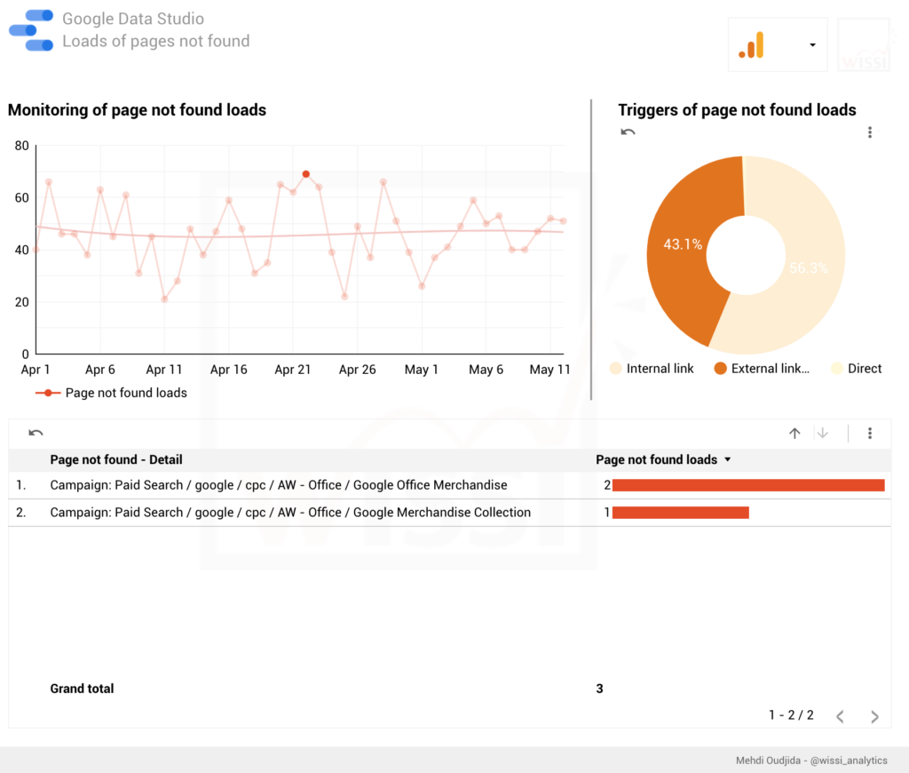
Google Data Studio can help you to address a lot of challenges of dashboarding, reporting or data story telling. You
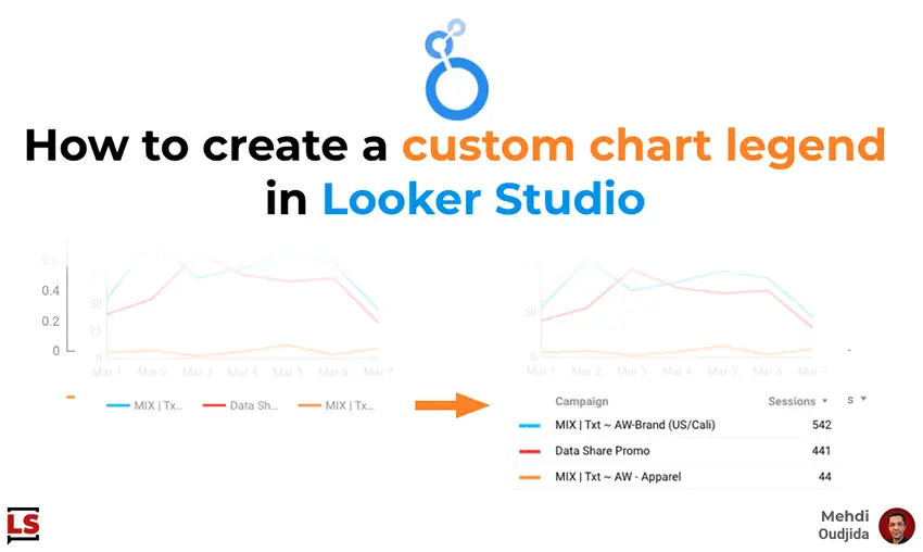
In most cases, built-in chart legend proposed inside Looker Studio (formerly known as Google Data Studio) addresses our needs. A
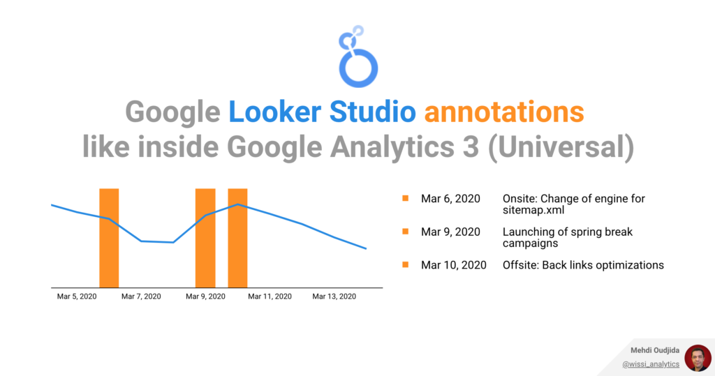
Marketers & website owners use to fill annotations inside Google Analytics Universal, adding temporal context to data with external events.