
Insight video clips with Gemini 3 for your standalone data story telling
A few months ago I created a just-for-fun report that displays product ranking data and track the associated volatility. At
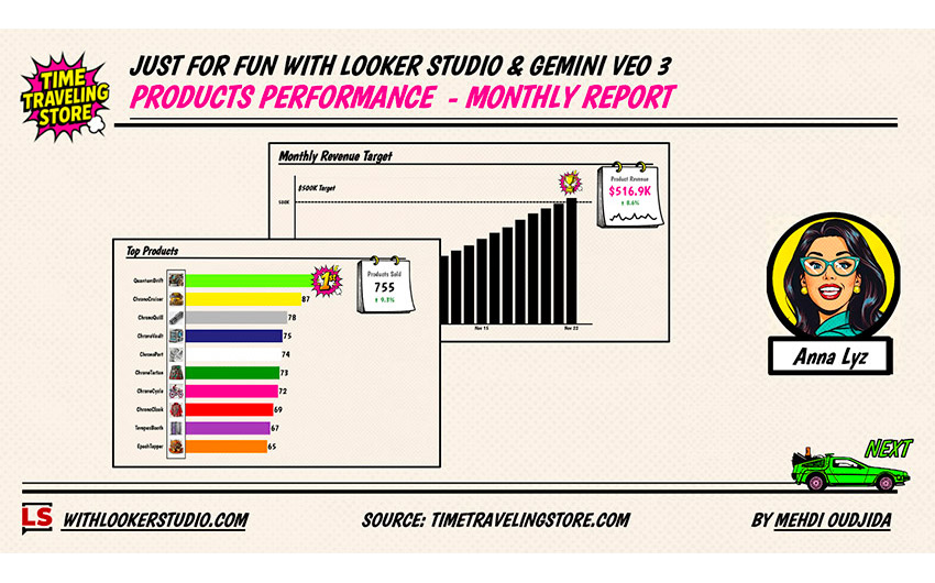
A few months ago I created a just-for-fun report that displays product ranking data and track the associated volatility. At
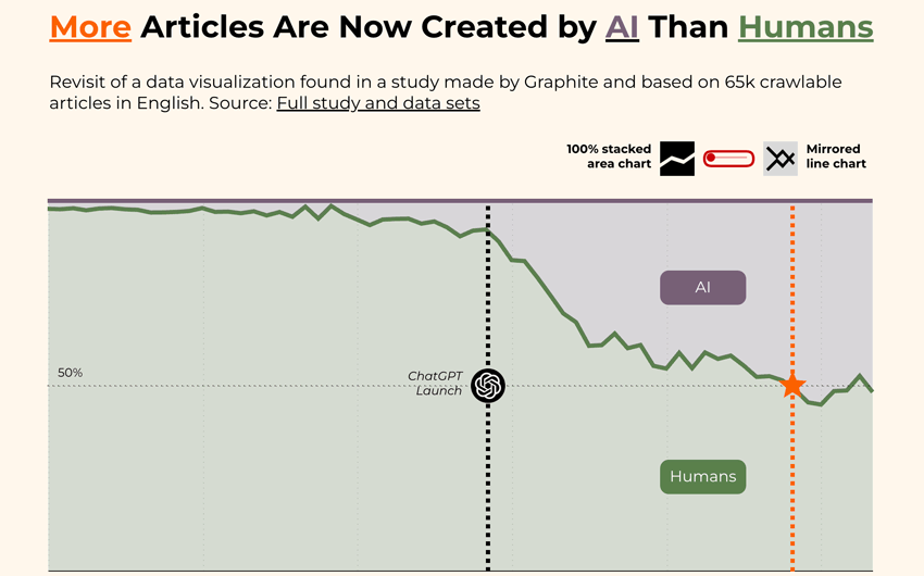
I’m not a big fan of mirrored line charts and that’s putting it mildly. Mirrored Line Charts I completely understand
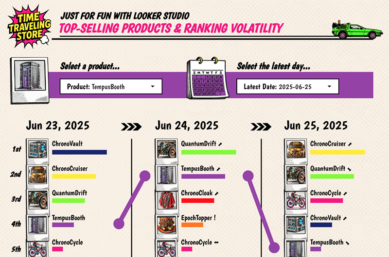
Here comes a new just-for-fun shared report designed with Looker Studio. This time, we are going to talk about visualisation
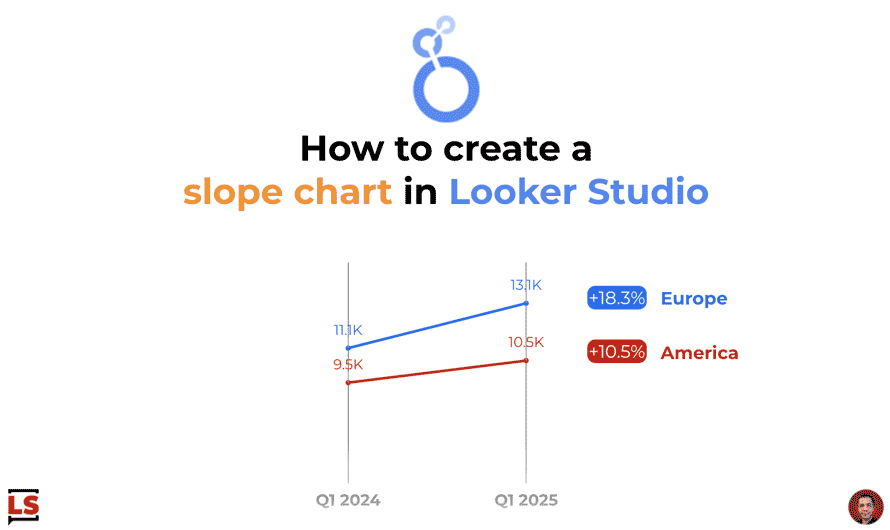
Let’s take advantage of the new style capabilities released yesterday to create a nicer slope chart than before with line
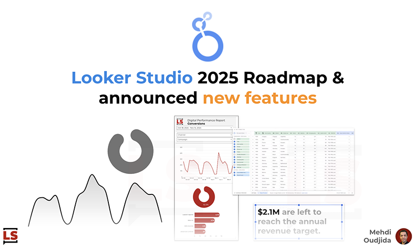
Few days ago, the Google Cloud BI team introduced the roadmap of Looker & Data Studio (ex Looker Studio) products.
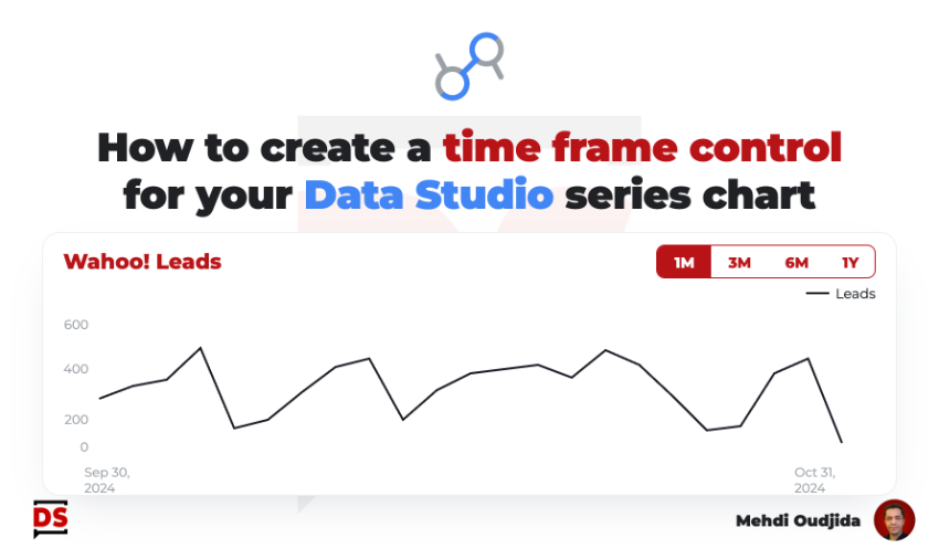
This tutorial describing how to create a time frame control has been inspired by a question from the community. This
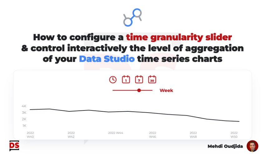
Why building a time granularity slider? I’m really disappointed when Data Studio (ex Looker Studio) reports – made for weekly

Information displayed by default inside an interactive report must be chosen preciously, and it is particularly the case for data
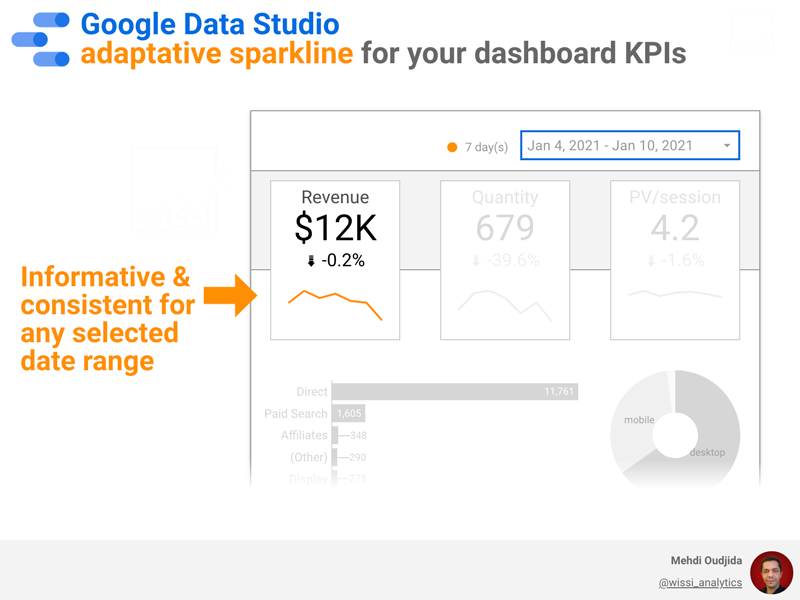
Dashboard KPIs are often enhanced with time comparison (with the previous period or the previous year) as a small score