Data Studio includes a native funnel chart. It works well for basic use cases, one dimension & one metric, one sort field. These free community visualizations go further, addressing at least two limitations that the native chart does not cover.
Overview & key features
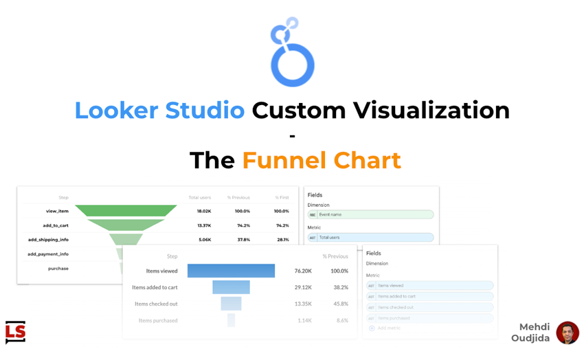
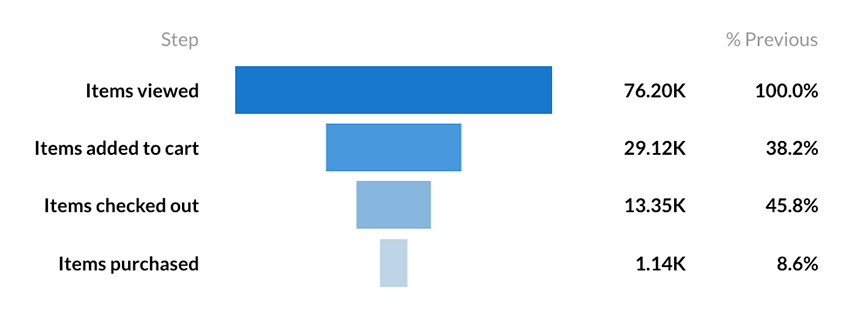
The first benefit is the data model flexibility. The native funnel only supports the dimension-based model. These custom visualizations add a multi-metric model, where each funnel step is a separate metric, a common pattern when working with pre-aggregated e-commerce events (e.g. “Items viewed”, “Items added to cart”, “Items purchased”). No dimension needed, no sort field to worry about: just drag your metrics in order.
The second benefit is about the tabular layout with derived columns. Instead of labels floating on bars, the funnel is rendered as a structured table with dedicated columns for the step name, the visual funnel shape, the raw value, the % vs. previous step, and the % vs. first step, each independently toggleable. Column widths are configurable as percentages, giving you full control over the layout.
Both variants share the same rendering engine, the same style controls, and the same CSS, so they look and behave consistently when used side by side in a report.
- Two Funnel Shapes
Choose between a Smoothed Bar (classic tapered funnel) and a Stepped Bar (horizontal bars) to match your visual style. - Fully Configurable
Colors, fonts, column widths, row height, header visibility — everything is exposed as style options in Data Studio’s property panel. - Toggle Columns
Show or hide the value, % of previous step, and % of first step columns independently to keep the chart focused. - Locale-Aware Formatting
Numbers and percentages are automatically formatted to match the viewer’s browser locale (decimal separators, compact notation). - Google Fonts Support
Select any Google Font from the style panel - Built-in i18n
Column headers (“Step”, “% Previous”, “% First”) are translated in English, French, Spanish, German, and Italian, detected from the browser language.
Two Variants for Two Data Models
Funnel data can be structured in two fundamentally different ways in Data Studio. The package provides one visualization for each.
Multi-Metric Funnel Chart
Use this variant when each step of your funnel corresponds to a separate metric in your data source. This is a common pattern for e-commerce funnels built with GA4 e-commerce events, where each step is a pre-aggregated metric (e.g. “Items viewed”, “Items added to cart”, “Items checked out”, “Items purchased”).
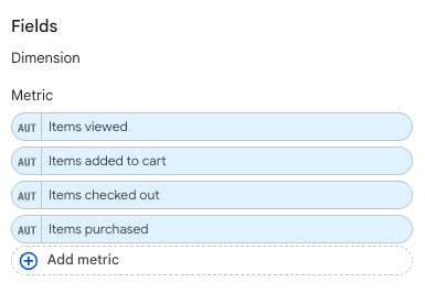
Data configuration
- Dimension: none
- Metrics: add 1 to 15 metrics, in the order you want them to appear in the funnel (top to bottom). The first metric is treated as the top of the funnel.
The metric names defined in your data source are used as step labels, so make sure they are human-readable.
Dimension Funnel Chart
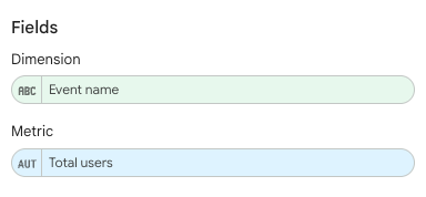
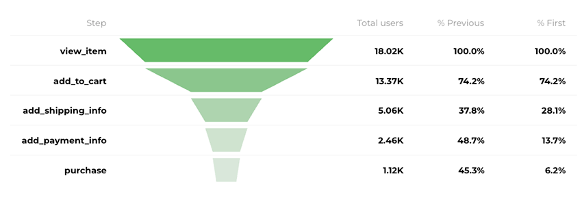
Use this variant when your funnel steps are rows in a single dimension, each associated with a single metric value. This is typical when working with prepared data broken down by a specific dimension, here with “event name” dimension holds values like view_item, add_to_cart, purchase, and the metric is a count (“Total users” for the example).
Data configuration
- Dimension: Add exactly 1 dimension. Its values will be used as step labels.
- Metric: Add exactly 1 metric. Its value for each dimension row determines the bar size.
Rows are displayed in the sort order defined in Data Studio. Make sure to sort your data by a numeric field (typically the metric itself, descending) so the funnel reads correctly from the widest bar to the narrowest.
Sorting matters
Unlike the Multi-Metric variant where the order is determined by the field order in the configuration, the Dimension Funnel relies on Looker Studio’s sort order. If your funnel steps look scrambled, check the sort settings on the chart.
Style Options
Both funnel variants expose the same set of style controls in Data Studio’s property panel, organized into three sections: Main, Header, and Data.
Main
The Main section controls the chart’s overall appearance and layout.
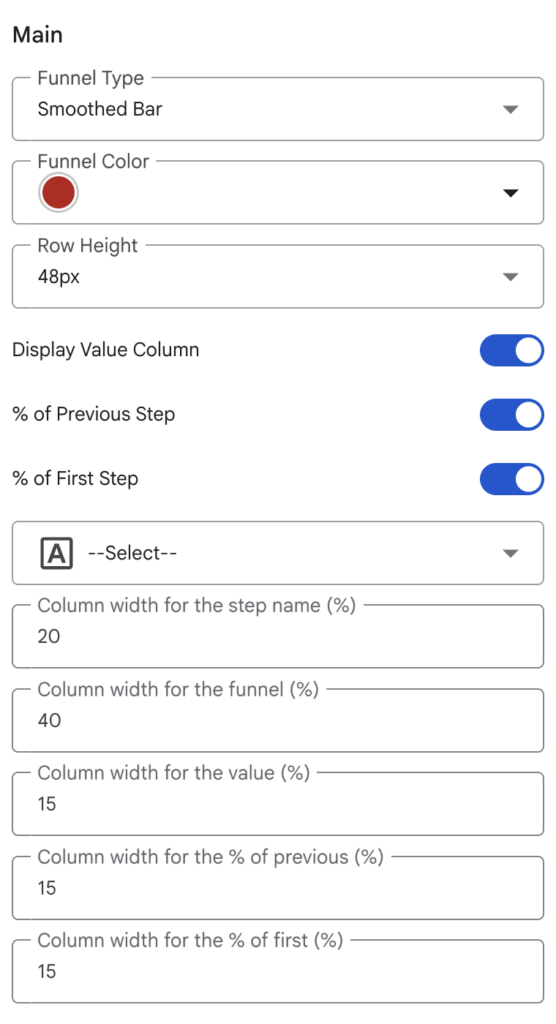
| Option | Description | Default |
|---|---|---|
| Funnel Type | Choose between Smoothed Bar (tapered trapezoids connecting one step to the next) and Stepped Bar (independent horizontal bars, centered). | Smoothed Bar |
| Funnel Color | Base color for the funnel. The chart automatically generates a gradient from this color: the first step uses a slightly darkened shade, and subsequent steps become progressively lighter and less saturated. | #b81318 |
| Row Height | Height of each funnel row in pixels. | 48px |
| Display Value Column | Show or hide the column that displays the raw metric value (e.g. “76.20K”). | On |
| % of Previous Step | Show or hide the conversion rate relative to the previous step. | On |
| % of First Step | Show or hide the conversion rate relative to the first (top) step of the funnel. | On |
| Font Family | Any Google Font. The font is loaded dynamically at runtime. | Montserrat |
| Column widths | Five text inputs to control the width (as a %) of each column: step name, funnel, value, % of previous, % of first. The values should sum to 100. | 25 / 30 / 15 / 15 / 15 |
Header & Data
These two sections let you style the header row and the data rows independently.
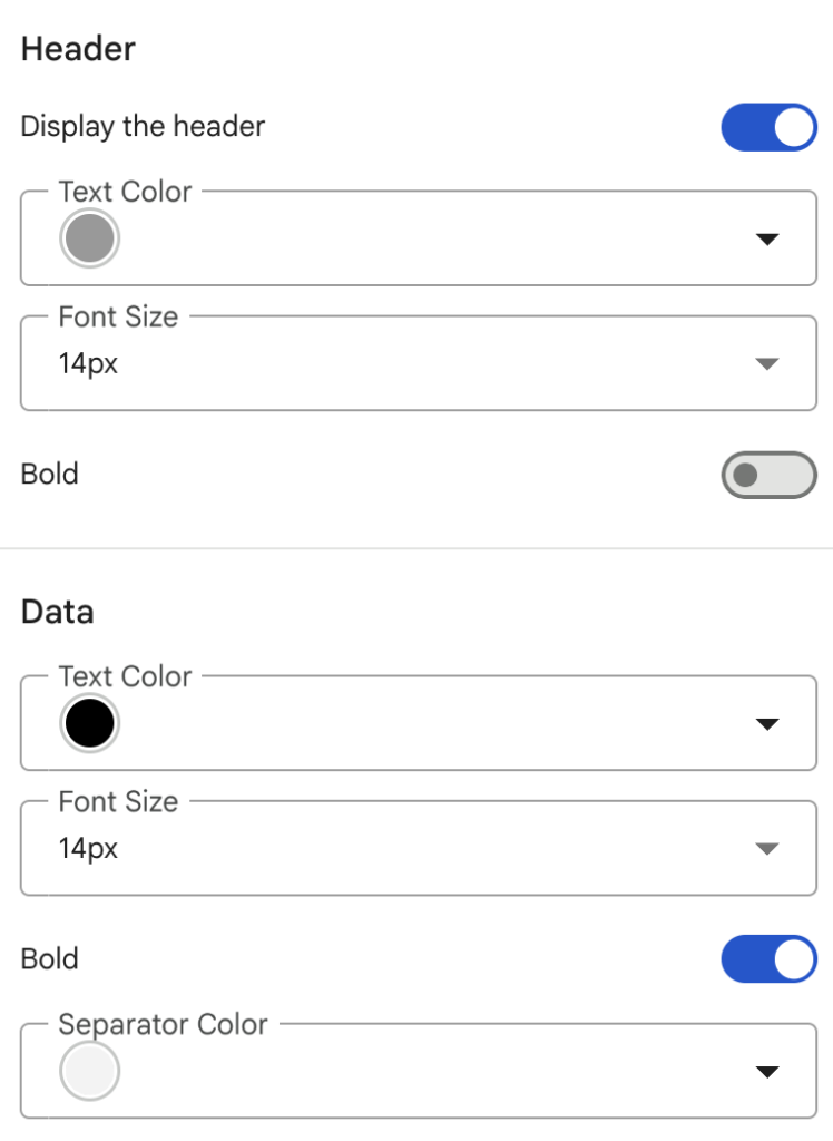
| Section | Option | Description | Default |
|---|---|---|---|
| Header | Display the header | Toggle the entire header row on or off. | On |
| Text Color | Color of the header labels. | #999999 | |
| Font Size | Font size for header labels. | 14px | |
| Bold | Toggle bold weight on header labels. | Off | |
| Data | Text Color | Color used for step names and numeric values in data rows. | #000000 |
| Font Size | Font size for data rows. | 14px | |
| Bold | Toggle bold weight on data rows. | On | |
| Separator Color | Color of the horizontal line between rows. Set to transparent to remove separators entirely. | #f3f3f3 |
How to install the funnel chart in your Data Studio report
To install one of the conversion funnel variations within your interactive report or Data Studio dashboard, simply follow these steps:
- Verify that your data sources are configured to allow community visualizations
- Go to the Resource menu > Manage added data sources.
- Select the relevant data source.
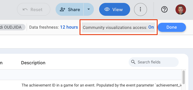
- Click on Community visualizations access at the top right of the data source panel and set it to On.
- Close the data source panel to return to your Data Studio report.
- Add the community visualization
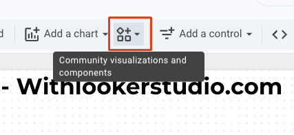
- Click the Community visualizations and components button in the toolbar (located to the right of “Add a chart”).
- In the pop-up, click Explore more.
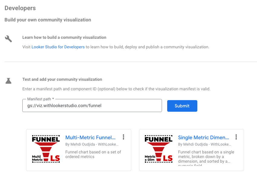
- In the “Partner Visualizations” panel, click the first option: Build your own visualization.
- In the Manifest path field, enter the following address and submit:
gs://viz.withlookerstudio.com/funnel - Finally, choose the desired funnel chart variation and add it to your report page.
- Configure the newly added visualization