I’m not a big fan of mirrored line charts and that’s putting it mildly.
Mirrored Line Charts
I completely understand why that choice is often made, especially when a data viz is meant for a broad audience.
We can all agree that in this kind of chart, the second line is redundant. But it’s true that those lines make it easier to tell a chronological story:
two trends evolving in parallel, key events, a timeline, curves that cross, and a final outcome.
The sense of time progression, and the convention of using lines to represent it, often takes priority over other good data visualisation practices and efforts to reduce cognitive load when reading a chart.
However, for people used to reading charts, the first question that comes to mind when facing a mirror line chart is whether it actually is a mirror line chart. A kind of paradox…Instead of focusing on the key insight the chart is meant to convey, we first try to confirm that the value of one line is simply the result of an arithmetic calculation (here 1-x) based on the other (x).
100% stacked area chart
For this kind of situation, I much prefer 100% stacked area charts.
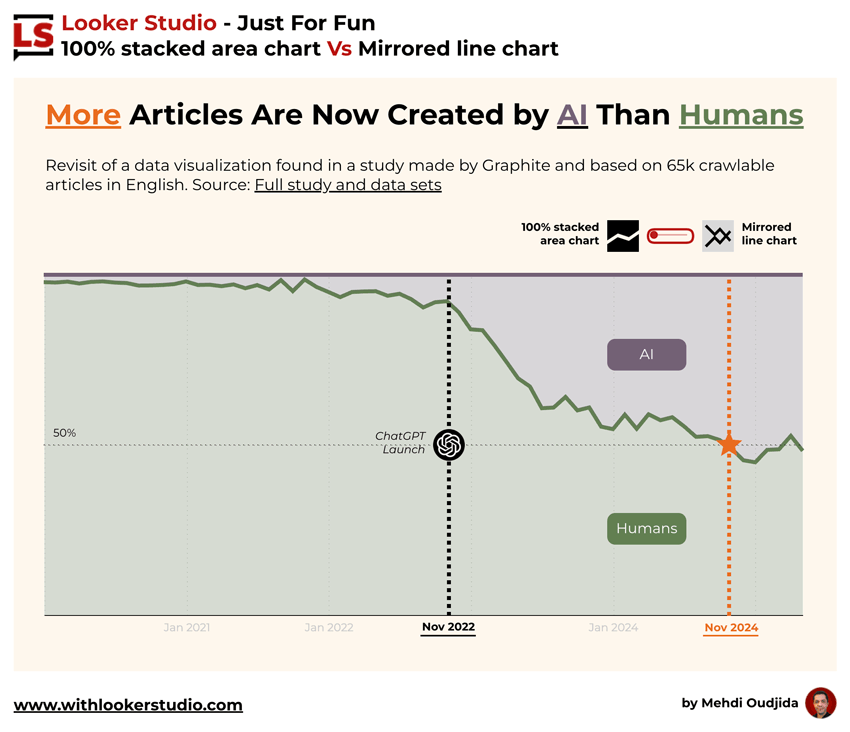
Areas make it easier to read the progression of each share, with a single main line dividing the playing field in two.
Yesterday, I came across this exact type of mirrored line chart again and asked myself the same usual questions.
I first discussed the methodology with Myriam Jessier on Bluesky (yes, there are people sharing on Bluesky…) about an article she shared and highlighting the growing number of AI written articles surpassing those written by humans.
Let’s revisit this data viz
Then, I asked myself that familiar question again, and it also brought me back to the good old days when I used to take part in “Make over Monday” by Andy Kriebel and Eva Murray, which gave me chances to practice my data viz skills from time to time.
So I dove back in and revisit the chart I was looking at, going for a default 100% stacked area viz, but leaving the user the option to switch to a mirror view, and injecting some design ideas.
All of course built in hashtag#LookerStudio, with my usual bag of tricks.
The exercise reaffirmed my opinions, even though I can still see the value of the mirror chart and the related adopted conventions.
Ingredients: Looker Studio features
To build this interactive report, the following features have been put together:
- Main Chart types: Line chart and 100% stacked area chart
- Dimension scorecards for the line labels
- A parameter for the selection between the 2 data viz options
- A slider for the control at the top right of the visualisation
- A Google Sheets data source
- Some calculated fields
- Conditional formattings
Access to the Looker Studio Shared Report
Voilà. Now it’s time to see all these elements and thoughts in action.