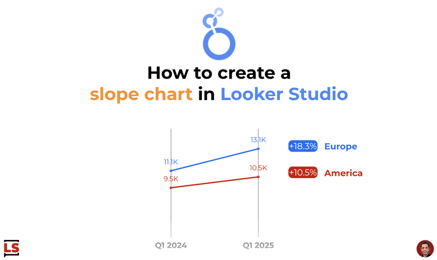
Let’s take advantage of the new style capabilities released yesterday to create a nicer slope chart than before with line chart customizations.
The New grid line options let you set colors and line styles for individual axis grid lines.
On the other hand, slope charts can be considered basically as specific line charts with 2 data points.
In the example below, I improve my slope chart using the new grid options of cartesian charts.
To execute the same thing, follow the steps below.
In the Left Y-Axis section
- Hide the left Y-Axis and the related axis title
In the Grid section:
- Hide the Y-axis gridlines
- Show the X-axis gridlines – The vertical lines of X-axis are typical of the slope chart design
- Select the same color than your X-Axis label
In the X-Axis section:
- Hide the axis line
Voila, your line chart becomes a better slope chart thanks to few style customizations.
A nice viz solution to display changes over time for few dimension values and for 2 specific periods.
For information, before taking care of axis, I included the % of change of each continent with 2 Query Result Variables, a nice feature we discovered together few weeks ago.