
Daft Punk moving Tron bikes with Looker Studio sliders…just for fun
For infographics with dynamic data, and almost just for fun, let’s change the position of a picture following the interactions
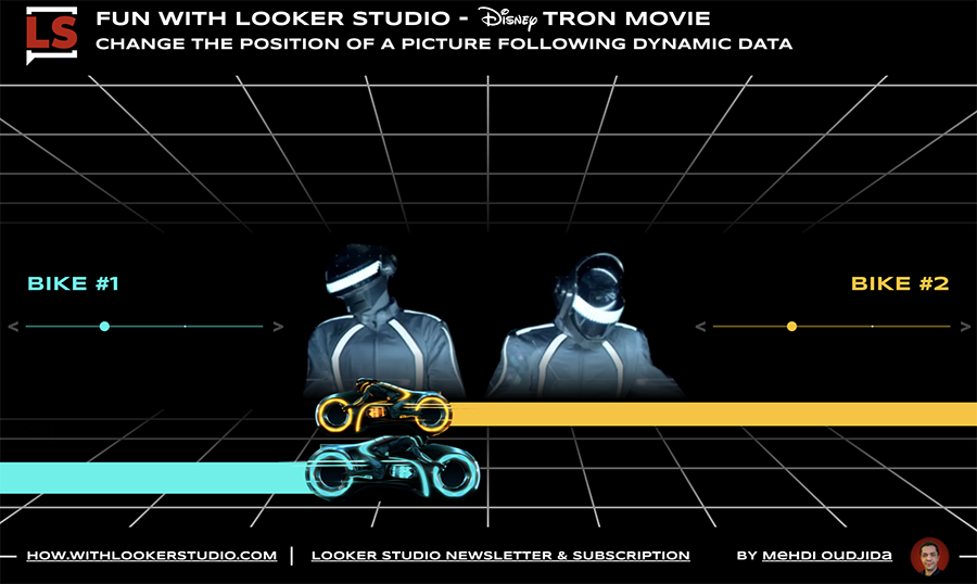
For infographics with dynamic data, and almost just for fun, let’s change the position of a picture following the interactions
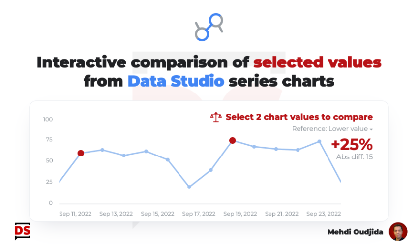
Keeping charts as simple as possible is very challenging. For some cases, a single interactive feature can offer a first
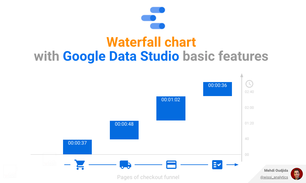
Waterfall charts are nice & efficient to visualize cumulative values of a metric and the related participation weight of each
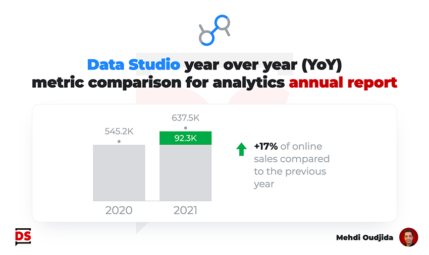
Building a statistics annual report is a nice exercise for challenging the way to display metric values comparison over a
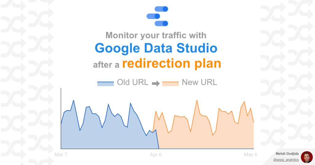
The preparation & the deployment of a URLs redirection plan require method, know-how, a lot of rigor of execution, involving
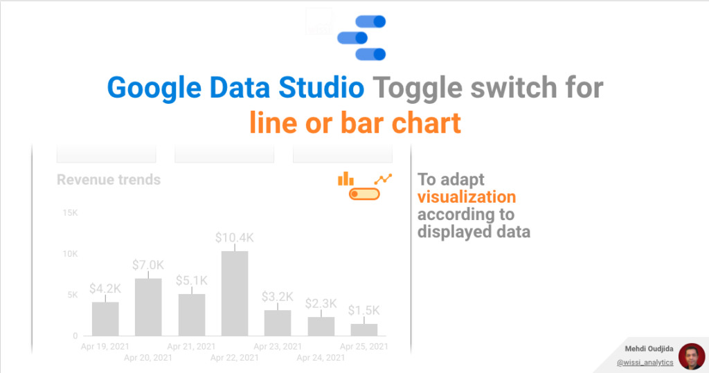
Let’s continue the exploration of Google Data Studio parameter feature with this new example. This time, we will combine parameter
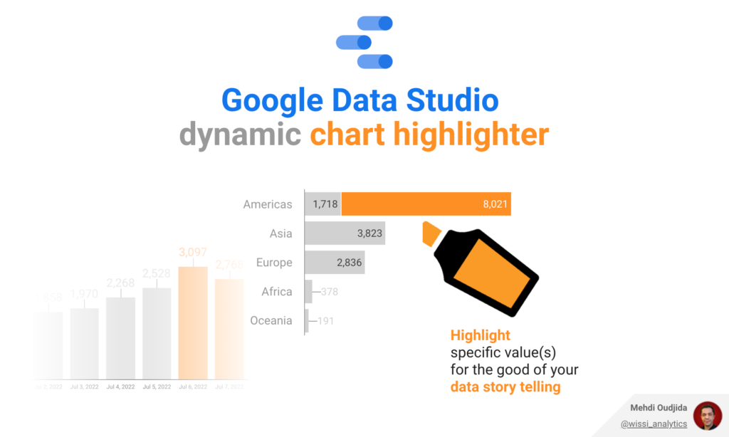
Conditional formatting is typically a very good automatic highlight system for dashboards to read fast and see what it is
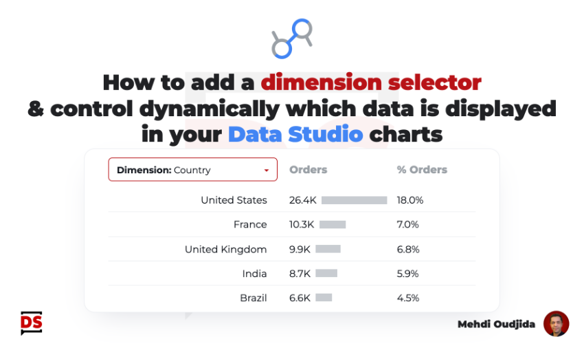
Let’s go back to the basic to create a simple dimension selector. This allows to give the control to report
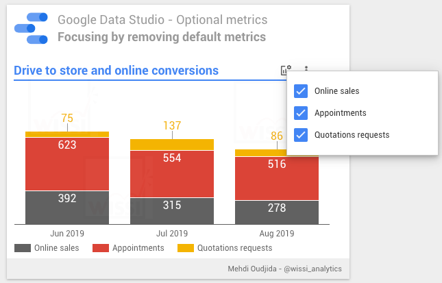
Google Data Studio optional metrics is a nice feature providing possibilities to prioritize metrics comparing to others. Users decide to
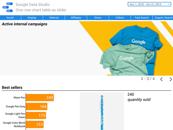
The 22th of October, Google Data Studio team added the option to create table chart with one row per page