Author edit – November 14, 2022
I wrote this article in July 2019, just after the release of treemap chart on Google Data Studio. Since then, our data viz has been rebranded to Looker Studio and a lot of changes on the user interface have been applied. The opportunity (and the necessity) to refresh this article 🙂
The result
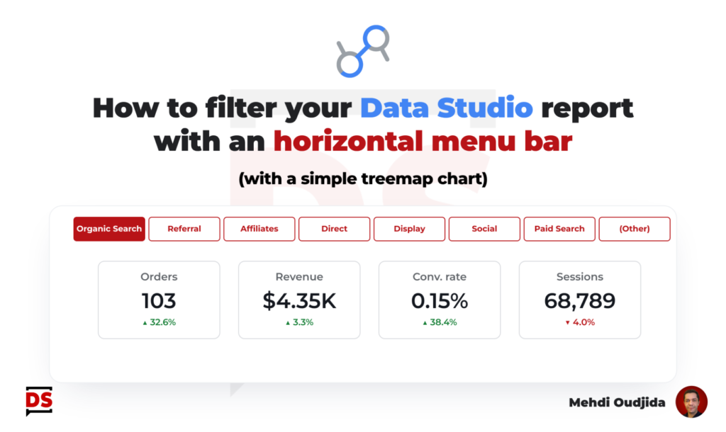
This article describes how to create an horizontal menu bar (like on a website) to use it as a dimension filter. First, let’s discover the result below.
Unlock free access to the full article
Access to this article written by Mehdi Oudjida, Data Studio Expert, is completely free: enter your email address to receive an access link to the full article.
Your email address is only used to send the link, and for the newsletter if you tick the box. It is not stored on this site.